When I saw skataviz I knew I had to try it, I’m into skateboarding and I’m into data viz so it only makes sense. The problem is I don’t spend much time thinking about 3D physics anymore and I’ve never spent much time with hardware sensors. So I decided to start with what I had: my Galaxy Nexus phone and Tributary.
I installed AndroSensor which lets you record the values for all your hardware sensors to a CSV file. I then used Android File Transfer for Mac OS X to copy the file to my machine (for some unreasonable reason you can’t just mount your phone with the latest Android…). Once on my machine I needed to clean up the file, which actually used semi-colons (;) instead of commas (,) to separate values (that would be SSV helllooo :P ).
The fun started when I copied the csv file into Tributary and plotted the data:
I was trying to integrate the accelerometer data over time to get the path that my phone took as I threw it onto my bed. You would expect a parabola but that’s not what I got. So I decided I should improve my understanding of what was going on and look at things with one less dimension, 2D (using d3.js):
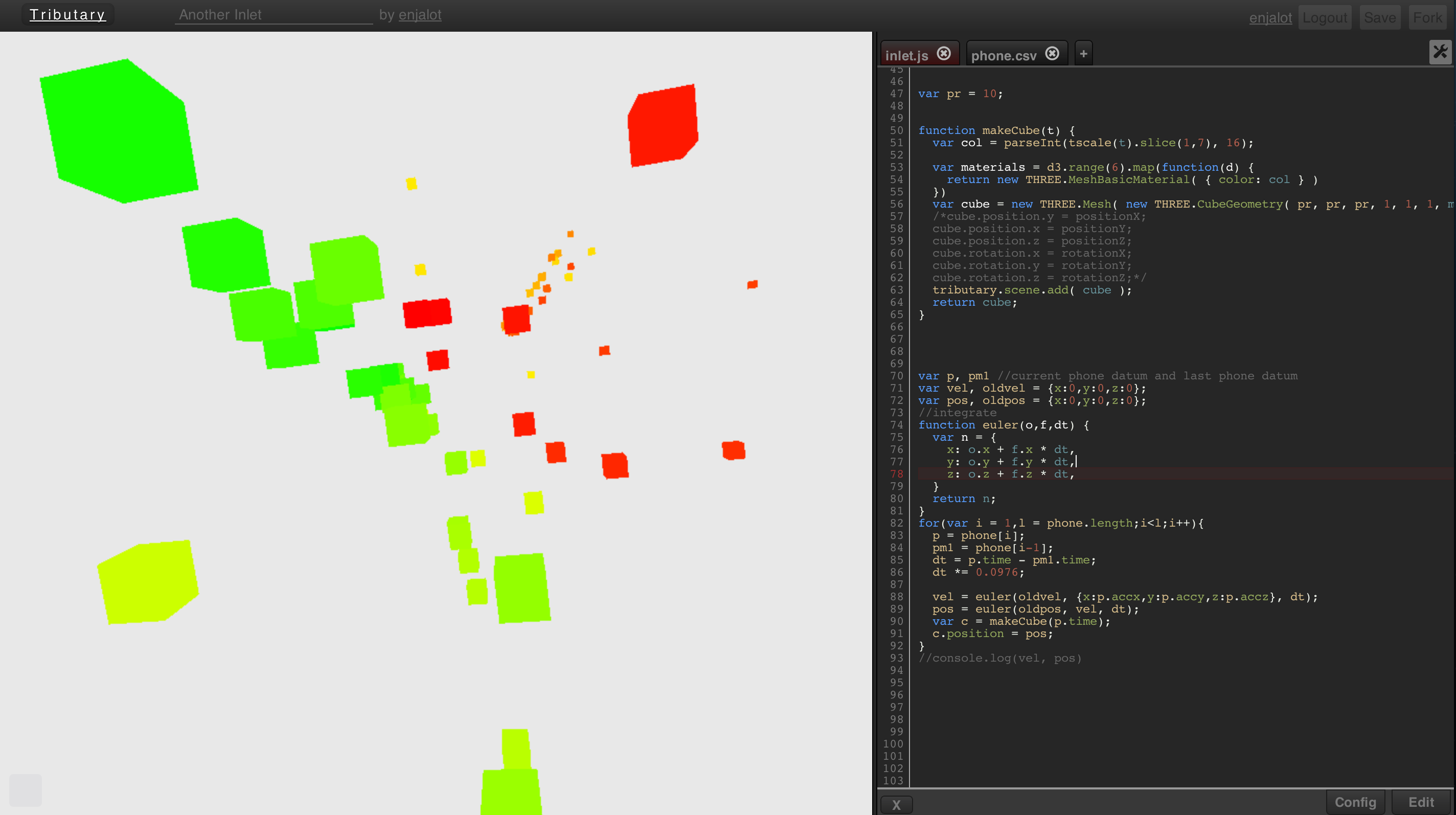
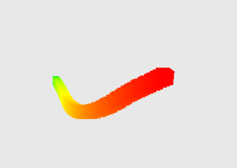
This is about the time I hit up my friend and old classmate Geo who has been hacking on Tributary with me and has retained more of his Scientific Computing training than it seems I have. He suggested I drop my phone straight down to minimize the variables, and he also helped me remember how to do Euler integration because I had a couple glaring bugs in my implementation.
We ended up with these 3D examples:
We aren’t exactly finished though, after looking around the internet our approach to determining the path is pretty weak as Euler integration is susceptible to error (and it’s too late in a Saturday afternoon for me to implement an Runge-Kuta 4 in javascript, that exercise is left to the reader). Also we aren’t using the Gyroscope data to compensate for gravity, in fact we aren’t dealing with gravity at all (we should be subtracting 1g from the accel data). I’ve included some links at the bottom of this post for further investigation.
I’d also like to note that I had to change the headers of the CSV to make it more accessible for programming (you can see how in the comments in the code).
I’ve been playing with Cubism.js lately and I tried throwing together a quick horizon plot for the sensors: http://tributary.io/inlet/4242097/
It’s a little janky, but I’m still trying to wrap my head around horizon charts so any feedback is welcome. One cool thing is that I (think) I figured out how to make custom metrics from JSON time series rather than using a Cube or Graphite source.
Further reading:
- http://www.sfonge.com/forum/topic/measuring-movement-accelerometer-and-gyroscope
- http://www.sfonge.com/forum/topic/compensating-accelerometer-data-gyroscope
- Google Tech Talk on Accel/Gyro/Compass sensors and fusing them together


Pingback: Phone accelerometer visualization | geo's notes
How did you obtain the 3D images? I’m working on a proj for data visualization similar to yours but I need advice on transporting the accelerometer data into a 3d visualization not unlike yours.
I used an app to record the accelerometer data and then plotted it using d3.js and three.js. I linked to and described the process in detail in the blog post…